

I started
with a simple design. The initials sketched inside an oval, very roughly drawn.
But I needed to add ‘Productions’, so I placed it underneath, which made the
design feel more together and complete.

 Not quite satisfied with this design, I
looked at existing Production Company logos and saw that some put words
together, so I tried it. First vertical, but I thought it looked a bit tall and
stretched so I tried it horizontal and I thought that looked better. However, I
thought it was too simple and not very memorable. If the logo isn’t original or
unique, an audience will not remember it and will not know to look out for it
if they enjoyed the film.
Not quite satisfied with this design, I
looked at existing Production Company logos and saw that some put words
together, so I tried it. First vertical, but I thought it looked a bit tall and
stretched so I tried it horizontal and I thought that looked better. However, I
thought it was too simple and not very memorable. If the logo isn’t original or
unique, an audience will not remember it and will not know to look out for it
if they enjoyed the film.
I had an idea of perhaps overlapping the
three letters, but the ways I tried didn’t show all three letter clearly enough,
so I abandoned the idea.
I then thought of creating the logo in the
style of a circuit board, but it just didn’t seem to fit us a production team.
So, after thinking a bit more, I thought I’d try using a silhouette in the
logo.


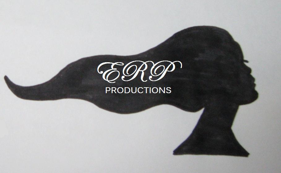

I
settled on the silhouette of a long haired woman because the three of us are
women and, if we chose to animate it, we could have the hair moving. I tried
having the writing to the side of the woman but it looked like two separate things
so, once I’d imported the images onto my laptop, I inserted the text on the
woman’s hair. I decided that I liked this logo the most and with a bit of
editing and refining, I was pleased with the result.
.JPG)
.jpg)
No comments:
Post a Comment