Sunday, 10 February 2013

Title Sequence Research

There are many ways to create a title sequence and the way a director chooses to go all depends on the genre and themes of their film. Because of the film I am hoping to create, I will mainly look into how directors of horror films decide to construct their opening titles.


In Halloween, John Carpenter chose very simple visuals, with just a simple carved pumpkin lit up. This helps this focus the audience on the film world and pumpkins represent Halloween so it was an obvious choice. The colours used are orange and black which are the colours of Halloween. Everything relates back to the title. The simplicity of the slow fades when the text changes and the gradual zoom in, draws in the audience and focuses them so the concentrate on the film. A simple and repetitive but eerie soundtrack creates mood and atmosphere.

 
Alfred Hitchcock also chose to create a fairly simple opening sequence, using horizontal lines and only black, grey and white. However, unlike Halloween, the text distorts and this tells the audience that something isn’t right. What creates the atmosphere in the sequence is the use of music, it is sharp and jumpy which can rise anxiety levels and put the audience on alert so they absorb the film and are drawn in.
 

Stanley Kubrick takes a very different approach by placing the credits over the film. It shows a long winding road with a single car motoring along.  The camera is slowly following the car moving to different and angles, sometimes passing it. At one point it has the perspective of another car moving along the road and then it is as though it just drives off the road and then the edge of a cliff, this may make the audience feel uncomfortable and insecure and tell them that something isn’t quite right. The music is fairly slow and plod-y but the ghost screams and high-pitched sounds indicate that something is wrong and there is danger.
 
 
David Fincher uses much more complex method than the previous three directors. He uses a very cringe-y, uncomfortable piece of music which fits the images that are being shown on the screen. He uses images which aren’t normal as well as double exposure to make the audience feel detached and a bit sick. Every single image could be taken in at least one or two ways so each individual will take something different from the sequence. He does this so he will definitely get to each audience member not just some who are uneasy about certain things. The images are yellowed and overlap/shake which gives the sequence an aged feel. The titles are sometimes over the film and other times they are on a plain black background. They look as though they are scratched in and the flicker and reverse, these things suggest that something isn’t right. Also the colour red is used frequently which can suggest blood and danger.


Sam Raimi chose to merge animation film together. The animations are of drawings which are in a similar style to those in the bible, and then when real film appears, those drawings that the animation created lay on top of the material. The drawings are of suffering people, with screaming and pained expressions which link back to the title of the film as you are supposed to suffer in hell for the bad things you did on Earth. The word ‘Curse’ appears on the screen and that suggests that something evil is it work. The effects make the sequence look aged and that makes the audience think that it is a centuries old curse. Towards the end a picture is set on fire and is burned, this can suggest that someone wants revenge. The text lies on top of the visuals and isn’t embedded, this makes them clear and easy to read. It also reminds the audience that the film isn’t reality but fictional.

Personally, I prefer titles where things are happening as the text is being shown because it keeps me interested and brings me into the film as well as revealing something about the film so I know whether I will enjoy it or not. For our film, I think that using a similar technique to ‘The Shining’ and ‘Drag Me To Hell’, will be effective because we can have action happening while the titles flash up, but they won’t be embedded within the film because I don’t think it would work very well because of our limited resources.

Saturday, 9 February 2013

BBFC Ratings and Similar Genre Films

U - Universal
Scooby Doo and the Ghoul School is a universal rating on the IMDB website, this is because of many things. This means that it only uses bad language such as 'damn' and 'hell' which aren't used regularly. In a horror film, with it being this low of a rating, you are only allowed to see things where characters are only put in danger, however will overcome it quite quickly. This can be reassure by using upbeat tempo busic that uses major and minor chords; but more major than minor. Few violent scenes are allowed unless this is used. No drugs are allowed to be mentioned throughout this film rating, and none are. As these ratings of films aren;t allowed danger that is overcome over a long period of time, you often see many sub plots suring and throughout this. This can build tension numerous amounts of times.
PG - Parental Guidance
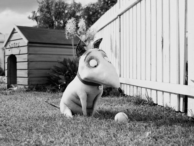
Frankenweenie has a parental guidance rating on the IMDB website. This basically means that some scenes will be suitable whereas some scenes won't be, for a general viewing. No bad behaviour is allowed to be promoted, just frowned upon in a ceratin context.this is like bullying, smoking, and drinking. PG horror films contain horror as well as comedy. They contain comedy in this low a rating of horror because comedy takes the edge of how tense situations can be, especially for little children. With violence in horror movies, you are not allowed to show how any injury was inflicted, you are only allowed to see the results of the innjury, unless the infliction was lacking in detail. Weapons will neither be promoted or glamourised withing this rating of horror film. This film obeys all of these rules and makes horror a fun subject for little children to watch.
12/A
Woman In Black is an example of a 12A/12 rated film by the IMDB website. The reason this has been rated a 12A because this lets lower audiences be allowed into the cinema to watch it if their parent think that this is actually acceptable for them to see it and not get psychologically harmed. 'Moderate violence' is allowed and injuries and inflictions are allowed to be shown but not in too much detail unless, in this case, it is a horror or a crime drama etc, and fits the context of the film. The BBFC rating of 12 allow the use of the word f*** to be ised during the whole film, but with infrewuent use. Physical threat is allowed for a 12 in this genre but is not allowed to be on for too long, in te same case, nor is psychological threat. Woman in Black is a prime example of a suitable rating. It does have physical and psychological threats at times, but neither of them are prolonged.
15
Orphan is an example of a horror film that is rated 15 by the BBFC. A horror film of this genre and rating is allowed to use strong violence and language frequently, in this film also there is brief terms and scenes used that would be considered to be discriminating. This could build tension for the audience as you are allowed more things to use that would make things scarier from the things that. The word c*** is allowed to be used occasionally, however. In horror, the guidelines are that there is allowed to be strong menace and threat but the threats should not be sexual or sadistic. This film does not consider any sexual threat not sadistic threats but the film covers aspects that wouldn't be necessarily talked about in real life, nor come across. Any behaviour and actions shown in this film should not convince impressionable teenagers to do anything stupid.
18
Saw is a film that is rated 18 by the IMDB website and BBFC. This is because of a few main reasons. An 18 is allowed strong violence including sexual violence and strong scenes of sexual activity. In this case, strong blood, gore and horror is shown n this film, which makes this film an 18. You see many circumstances where people are made to kill themselves, by a person's contraptions. There is allowed to be strong and sustained threat in a horror film classed at 18. Even though it is considered that adults can watch whatever they want, there are still some things that have to be cut from 18 work. These are things such as really strong graphic content of sexual acts and things that break the criminal justice system. All Saw does is show really bad horror with blood and gore and sustained threat.


Wednesday, 6 February 2013

My Production Logo Idea

  I looked into creating a logo for our production company, which we have decided to call ‘ERP Productions’ because it is a combination of our initials and it has a nice ring to it, as well as being original.


   I started with a simple design. The initials sketched inside an oval, very roughly drawn. But I needed to add ‘Productions’, so I placed it underneath, which made the design feel more together and complete.
 
   Not quite satisfied with this design, I looked at existing Production Company logos and saw that some put words together, so I tried it. First vertical, but I thought it looked a bit tall and stretched so I tried it horizontal and I thought that looked better. However, I thought it was too simple and not very memorable. If the logo isn’t original or unique, an audience will not remember it and will not know to look out for it if they enjoyed the film.


  I had an idea of perhaps overlapping the three letters, but the ways I tried didn’t show all three letter clearly enough, so I abandoned the idea.
   I then thought of creating the logo in the style of a circuit board, but it just didn’t seem to fit us a production team. So, after thinking a bit more, I thought I’d try using a silhouette in the logo.


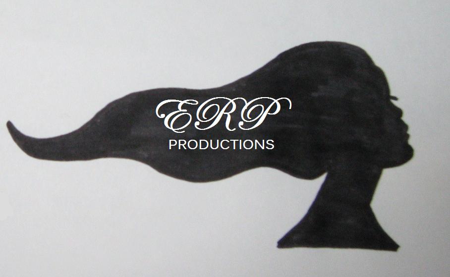
I settled on the silhouette of a long haired woman because the three of us are women and, if we chose to animate it, we could have the hair moving. I tried having the writing to the side of the woman but it looked like two separate things so, once I’d imported the images onto my laptop, I inserted the text on the woman’s hair. I decided that I liked this logo the most and with a bit of editing and refining, I was pleased with the result.

Tuesday, 5 February 2013

Production Logo Ideas


These are initial ideas I have had for our production team logo. I first thought to have a film reel in the background, and this would play the biggest part of the logo and then incorporate the lettering into that.


I also tried different font styles to see which worked better in the context it is used. 


This is the final idea I had for our production team logo. I thought the simple image of the film reel would go well as we are a film production company, and links with what we do. if we have time we could animate it, to show before the film, and we could have the images stamped on one by one, a little like the film 'The A-Team's logo.

Friday, 1 February 2013

Certification of Films


The BBFC rate films using classifications they have created. These classifications have set guidelines. Here they are:


I feel these guidelines are reasonable and that they are suitable for the group specified in each category.
   In terms of relating these guidelines to the genre of our film, because it's the content, I think it should be rated 15. The violence and gore may be upsetting or disturbing to younger viewers and strong language used in the film would be inappropriate for viewers younger than 15.
   There aren't many horror films that have been rated U, 'The Last Man on Earth' been one of the few, because the whole nature of a horror film is to be scary and if part of your target audience is 4 year olds, you are pretty restricted as to what you can do.
   The same applies to PG films mostly, however the films are not greatly aimed at young children, so films, such as 'Coraline', can afford to be more jumpy and have more moments where characters are in danger but they can't be too intense.
   Films rated 12 can afford to have more scary moments and build more tension to make the film scarier, for example 'Women in Black', so there are many more 12 rated horror films compared to the previous categories. However, because our film is quite gory and may contain strong language and an easily accessible choice of weapon, it would not fall into this category.
   I think that our film falls into the rated 15 category because it follows similar themes to 'Scream', which is also rated 15.
   The ratings 18 and R18 are for films with very visual and abusive violence and graphic sex scenes. Our film will most likely not contain any sexual references or sex scenes and the violence isn't too graphic so I do not believe that it would need to be placed in either of these categories. 'My Bloody Valentine' from 9181 is an R-rated film and 'The Human Centipede' is rated 18.


Rough Script - Individual